Model Recap
Recall we are building model to constructing process-structure linkages for pinning microstructures with precipitates and subjecting each sample to a grain growth process. For our model we have the following input and output:
Input: autocorrelation of pins with pins of multiple simulations. Output: chord length distributions of the corresponding simulations.
PCA Input
From our previous PCA results post:
You might remember that our 3D simulations are rather larger: 300x300x300. So when performing PCA on the autocorrelations of the pins and pins we get a data matrix that is of size (
n_simulations,27000000). That’s a big, dense matrix too. PCA on a dense matrix of that size is not easy on the memory of a computer.
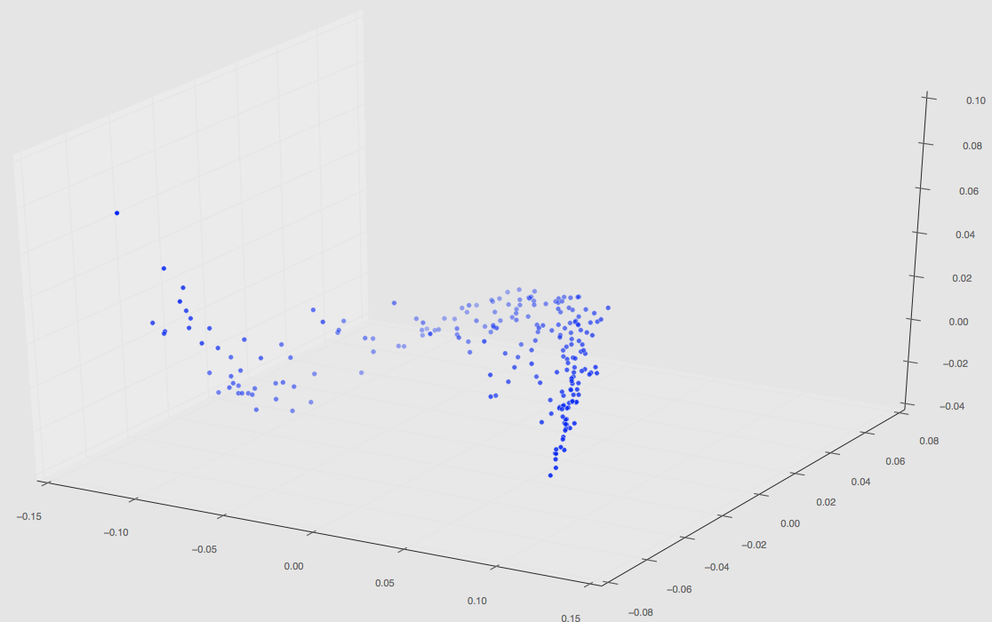
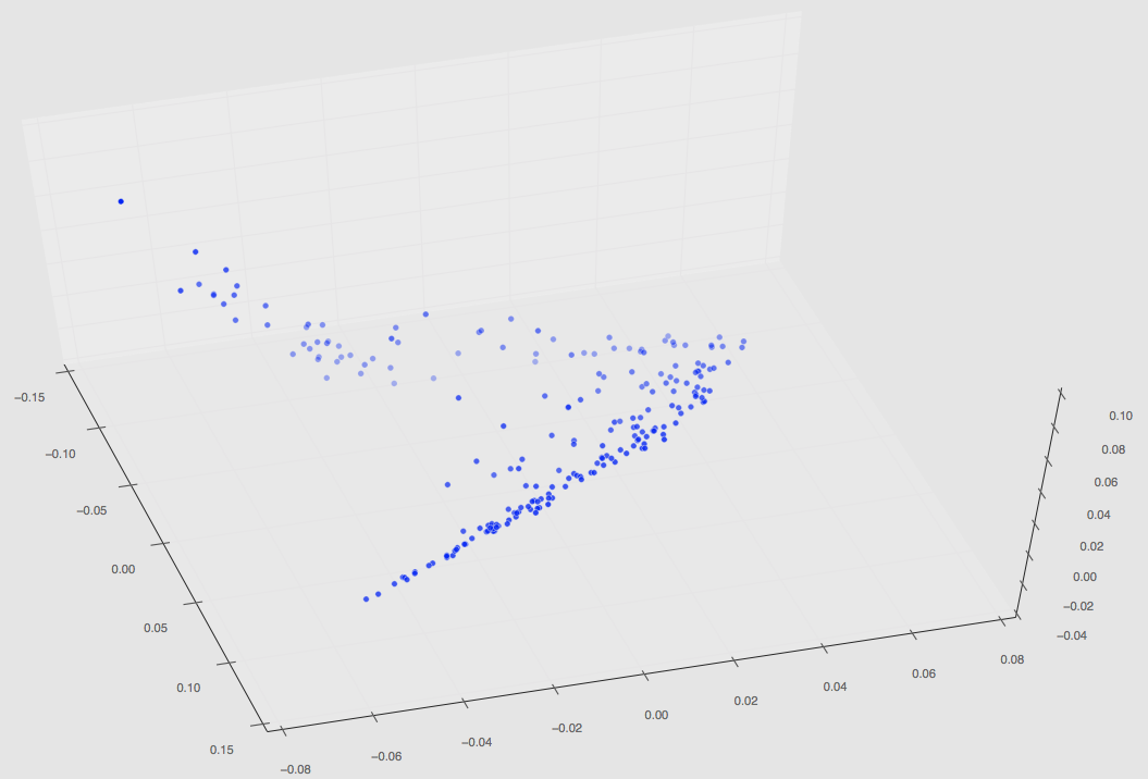
After submitting a PACE job using 64GB of memory, we finally computed 2-point statistics and PCA on our input data matrix of size (n_simulations,27000000) where n_simulations=220. 220 is the total number of simulations we were able to perform during semester, although it appears we will be running more this coming Spring for some further analysis.
Regardless, this set of 220 has finished and the plot in PCA space can be seen below.
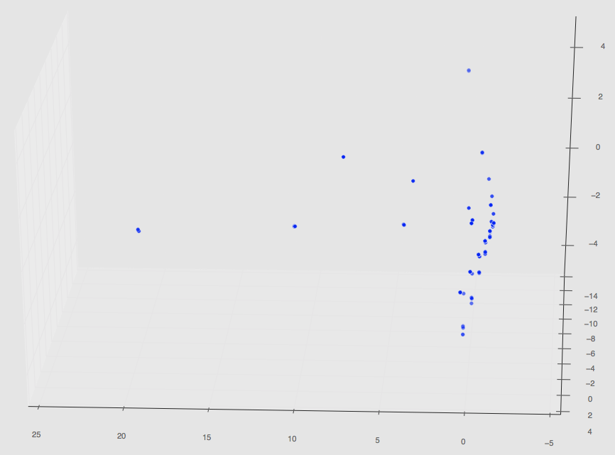
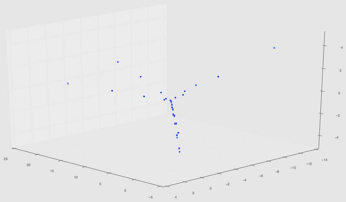
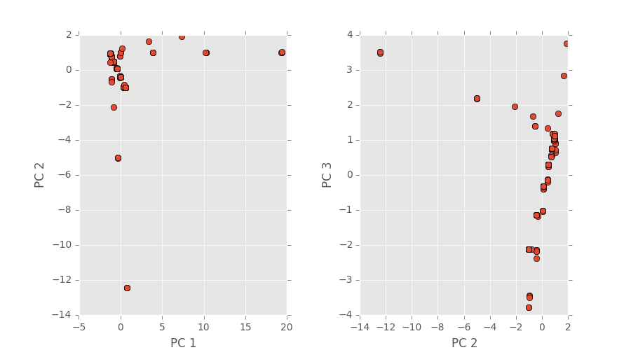
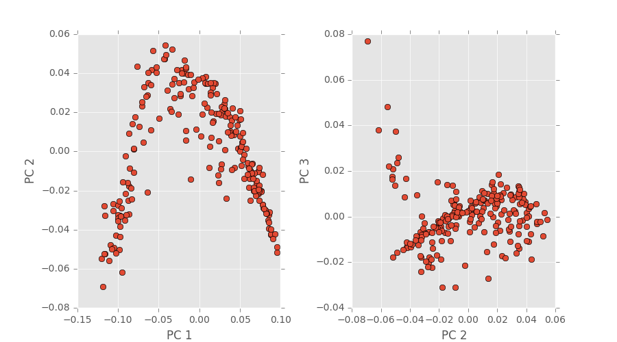
The first two images are 3D plots of the points. The second is a projection onto PC1,2 and PC2,3.
Notice that our original three path features from our initial PCA results are gone; this is because those PCA values are changed once more simulations are taken into a account during the dimensionality reduction step (not the spatial correlation computation step!).
Also notice that are a few random clusters way out in PC spaces; we believe these are the few classes that are unlike the others such as pinning using uniform distributions, quadrant clustering, or even our random shapes distribution. We’ll have some final plots that are color coordinated describing the classes soon.
These values have now been saved in a .mat file and can be called accordingly to perform regression.
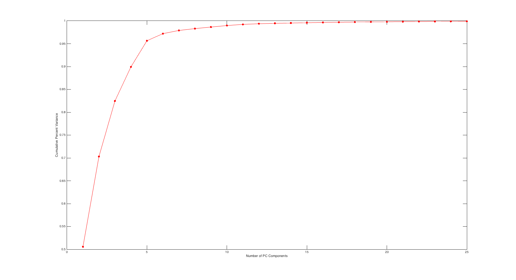
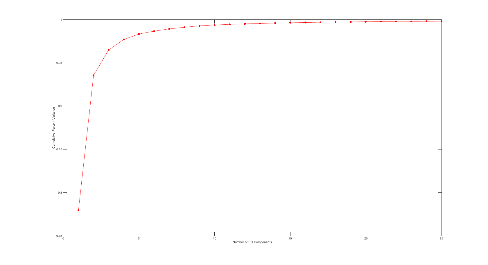
Scree Plot
It was brought up in the comments section that I neglected to show the scree plot for our PC values and the associated percent variance. I have included this plot below that shows cumulative variance percentage against number of PC values used.
PCA Output
Since our last PCA results post we have fixed our segmentation code. I ran PCA on our total chord length distributions (which remember is now 220) which has resulted in a PCA space plot depicted below.
These values have also now been saved in a .mat file and can be called accordingly to perform regression.
Scree Plot
Similar to the input side the plot below shows cumulative variance percentage against number of PC values used.
Now What?
Now 2-point statistics have been computed on both the input and output of our to-be-created model, it’s time to create said model and build our process-structure linkage. We have PC values on both sides of our model, so we now need to perform some kind of regression to see if our selected classes of microstructure data are representative enough to build a strong linkage.